
CHALLENGE
Because it had been a decade since Markus Zusak published a new novel, the marketing needed to remind readers of his last publication,The Book Thief, while still allowing Bridge of Clay to stand on its own.
RESULTS
Two distinctive visual looks were developed to address the challenges and the different consumer audiences.
SPECIALTIES
Branding • Creative & Art Direction • Hands-On Design • Print Collateral • Digital Collateral • Point of Purchase • Out-of-Home Advertising


When we first started brainstorming the visual direction for Bridge of Clay, it was widely agreed on the team that we wanted clean and sparse visuals. The first visual approach that I developed focused on dirt against a stark white background with The Book Thief prominently featured in the text messaging. This visual approach was targeted to retail consumers. However, we quickly realized that we needed a second approach that connected to The Book Thief visual branding that targeted the teacher and education market where the trade paperback is widely available and used in curriculums. This second visual approach adapted the visuals to a brown background evoking the dirt and drawing from the widely-recognized The Book Thief trade paperback cover. This visual approach was also used when necessary visual highlights were needed in the retail consumer portion of the campaign.


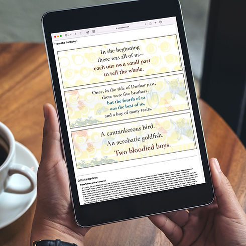


Role: Designer / Art Director • Marketer: Jules K. • For: Random House Children’s Books / Alfred A. Knopf • 2018